

Toolkit: Sketch App
Type: B2B | Internal Tool | Software
Focus: UI Design
Duration: Ongoing
1. Backstory
In 2019, I was contracted with AMI to create an iteration of a new feature that was scheduled to be in the product lifecycle. I was tasked to create a design system for this specific platform and what I learned in the beginning was that the company was trying to expand their products with the same components for future products.
product team

Xavier Jauregui
(Vice President)

Wolfram Donat (Software Developer)

Wedge Oldham (Chief Software Engineer)

Stephan Themis (Front-End Developer)
2. RESEARCH
HOW DO OTHER ORGANIZATIONS ORGANIZE THEIR DESIGN SYSTEM?
Started with exploring other design systems and audit how they documented their components. In this case, I primarily focused on buttons, tabs, and navigation for this project.

Tabs explored on Material Design

Navigation documentation and use explored on Material Design

Usage info on Buttons on IBM Carbon Design.
From the audit, I was able to conclude the necessities needed to document components
Specs and pixel spacing: Identify pixel width and height within component
Code and class: Adding any .css and .html conventions needed to build component in development.
Usage case: Present how the component may be used in scenario settings.
Examples: Present components that have occurred or can occur.
document
WHAT CAN I DOCUMENT IN THE CURRENT PRODUCT?
I analyzed the designs, created, and documented the following areas that had different use cases. Focus for this assignment was tabs, buttons, and navigation.

Tabs and Navigation displayed on the UI.

Button at different sizes.
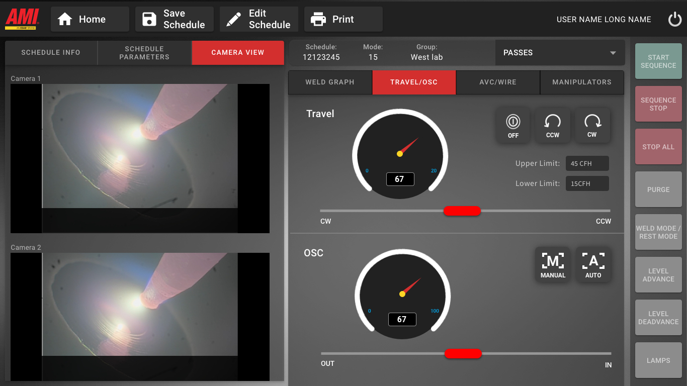
Tabs and Buttons.
Style Guides
USING THE PROVIDED COLORS FOR DOCUMENTATION PROCESS
Style guide was previously created by Nectar (design agency), color scheme was used during the documentation process.

3. DESIGN and documentation
COMPILE THE INFORMATION
Based on the audits of other design systems, I was able to solidify a starting ground for this design system documentation as inspired by other guides.


4. OUTCOME AND TAKEAWAYS
THE INDUSTRIAL EXPERIENCE CONTINUES TO EVOLVE AND SO DOES THE PRODUCT
I was happy to see my designs implemented into the digital product and learned how to approach documentation and creating new components that can be recycled to future products. The machine has officially launched to different markets with sales from $2.7 billion in sales more digital products in development.