


TEAM & ROLES

Payal Talati (Product Manager)
Oversaw the vision, strategy, and idea of the Access Portal platform.

Andres Cardona (Front-End Engineer
)
Developed, deployed, and shipped all Chief Security products.

Ron Caton (Associate Director of Chief Security)
Oversaw the stages and products within the Chief Security Organization portfolio.
1. UNDERSTAND/PRODUCT THINKING
The CSO team was seeking to revamp Access Portal with a new look and feel and a improved experience navigating different layers of access within AT&T. The current site was not doing that due to confusing terminology and repetitive copy. which caused delays for AT&T employees to do their jobs without proper credentials. By redesigning one portion of the site, specifically Homepage, we hoped that the new design would reduce the issues and solve this problem.
1) People Problem
AT&T Employees are unable to access proper credentials to do their work based on their designated department. Most of these access issues have been documented as a ticket to I.T.
2) How did we know this was a problem?
The current interface displays a complex introduction to users due to repetitive terminology and a lack of onboarding onto the platform on how to better serve specific departments.
3) How do we know if we’ve solved this problem?
When AT&T employees and higher executives spend less time on the platform and ticket reports to I.T. are also reduced.
2. DESIGN STRATEGY
REVIEWING EXISTING RESEARCH
PERSONAS AND THEIR PAIN POINTS
Luckily the organization was already cycling documentation of various personas that AT&T mainly catered towards. After reviewing, I realized this product was only catering towards higher executives, but not entry or mid-level folks. From that, I drafted another persona to ensure that this product would cater to all AT&T employees regardless of status.

Existing Persona 1

Existing Persona 2

Existing Persona 3

New Persona Created
auditing the current site
HOW CAN THE INTERFACE BE REARRANGED?
As I was reviewing the site, I noticed there was a lot of components that had dedicated functions and links that couldn’t be rearranged. However, the hierarchy of the whole site was a bit messy and complicated to navigate due to lack of visual hierarchy, repetitive terms, and accessibility issues with color contrast.
One of the main things the team and I agreed that had to be present in the redesign was the following:
General Access
Sign-In Options
Manage Team Functions
To-Do List.

Original Site
STRUCTURING THE SITE ONCE MORE
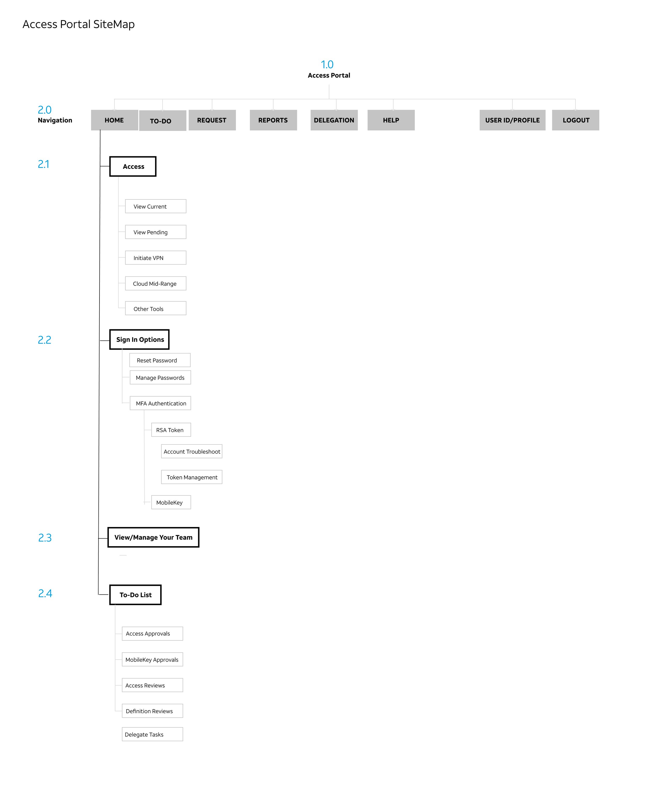
WHAT IS NEEDED IN OUR SITEMAP?
I presented a sitemap to the team to indicate which existing functionalities can be bridged over to the overhaul and as well as terminology changes to eliminate confusion when users view this site for the first time. Since we were focusing on the homepage, the following functions and links were documented to ensure back-end and APIs were not affected.
3. DESIGN EXECUTION
comparing competitors in the security space
HOW DO OTHER COMPETITORS MAKE THEIR EXPERIENCE SEAMLESS?
I referenced other security based products to identify some common themes amongst their designs:
Simple Information & Headline: A topic is usually described in one word with some body copy.
Icon Utilizations: Icons are heavily used to guide users to connect the imagery with the topic information.
Use of brand colors: Colors allow users to distinguish areas and categories not related to each other in proximity.

Google Account - Security Settings

Twine Website
Visual Designs
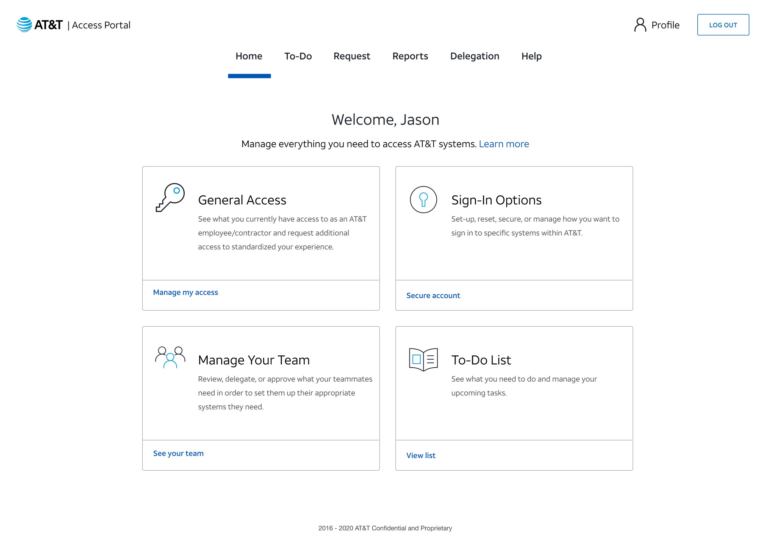
THE REVISED LAYOUT OF ACCESS PORTAL HOMEPAGE
After comparing from a variety of competitors, I went into visual layout creation to present to the team for potential Q1 2021 launch. From the three layouts presented, version 1 had the most potential and capabilities to ease the start of the journey, especially having utilities operated as a side navigation.
The other versions were not capable from a development perspective due to creating another container of links as the delay from the front-end perspective.

Version 1

Version 2
Version 3
4. OUTCOME AND TAKEAWAYS
THE START OF MANAGING YOUR TEAMS
The execution helped the CSO organization tremendously from a design perspective as it gave direction to what Access Portal was going towards. The outcome from this was that the design was launched during Q1 2021, however the rest of the experience was still yet to be improved and redesigned to match look and feel.
The ultimate takeaway I took was that designing for larger and legacy systems would take time and design iterations would not be as fast. From this, I empathized with many of my co-workers on engaging the design process to my peers that were not familiar with UX and guided them to understand the relevance of it in their world.